Replicability of Environmental Vulnerability Assessment
Return to QGIS and PostGIS Index Page.
Return to Main Index Page.
Introduction
In 2014, Malcomb et al. published an extensive paper which outlined their methodology and research into the development of a multi-faceted climatic vulnerability assessment for Malawi. The authors positioned this household resilience assessment as an accurate and reliable tool to indicate areas of increased vulnerability due to the multiple types of data sources used for the model, such as extensive interview data and physical exposure data. Since these same data sources are available for a number of different countries, the authors suggest that this vulnerability assessment can be replicated in many different countries and be an important tool to inform experts and policy developers. Hinkel (2011) outlines that indicators necessarily simplify and distill complex realities, often in a format meant for decision making. However, specifically in terms of vulnerability indicators, Hinkel (2011) demonstrates that general assessments of vulnerability do not necessarily answer the question that they claim to address and that a range of subjective decisions must be made in order to create an assessment of vulnerability. Since Malcomb et al. position their model assessment as such a pivotal tool for climate change adaptation, it is necessary to ensure that their methodology is reproduceable and that the results obtained is agreeable with their conclusion. As such, in this lab I will follow the methodology of Malcomb et al. and attempt to reproduce their final outputs for Malawi.
Malcomb et al.’s Methodology
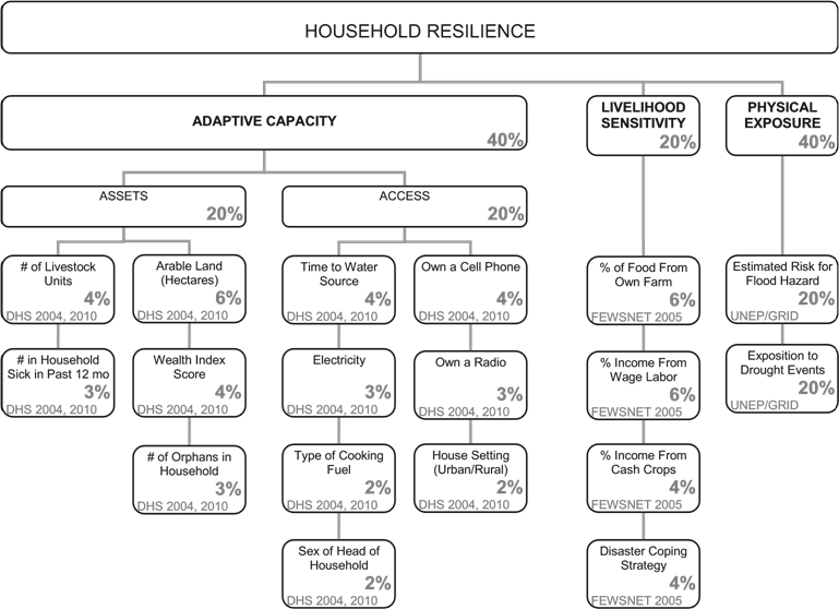
The graphic above, accessed from Malcomb et al. (2014) outlines how the authors weighted input data sets to create their vulnerability assessment. As you can see, the assessment incorporates data from three different sources. The authors performed their analysis at the administrative scale of Traditional Authorities, of which 203 were involved in the analysis. The data of the inputs were assessed along a quantile scale of 1 to 5 to represent resilience, with a value of 5 meaning the most resilient and 1 meaning the least resilient. These quantile values were then multiplied by the weighted value of their corresponding category.
Adaptive Capacity
The ‘adaptive capacity’ input consists of twelve categories of survey data about the socioeconomic assets and access of individual households. These categories are components of the extensive Demographic and Health Surveys (DHS) conducted by the U.S. Agency of International Development (USAID) between 2004 and 2010. According to Malcomb et al., this input enhances the vulnerability assessment as it considers socio-ecological issues of Malawi at the scale of household dynamics. When all 12 of the categories are combined, the authors chose to weight their adaptive capacity score as 40% of the overall vulnerability assessment. As you can see next to each category in the above figure, the authors applied a weight to each survey category which combined to equal the total adaptative capacity score. The data from the DHS is provided in cluster points at the scale of districts, of which Malawi has 28. However, the authors note that this large scale of data display is inappropriate to represent household scale vulnerability, so they disaggregated the data to the scale of TA. At this scale, the authors applied the quintile breakdown of the quantitative data obtained from the surveys. These quantile values were then multiplied by the weight of their corresponding survey category, collectively totaling to 40% of each TAs overall vulnerability assessment.
Livelihood Sensitivity
The authors state that they accessed this data input from the Famine Early Warning Systems Network (FEWSNET). This data is an assessment of livelihood sensitivity as determined through interviews conducted by the Malawi Vulnerability Assessment Committee (MVAC) in conjunction with FEWSNET and USAID. These livelihood sensitivity values were measured at the scale of livelihood zones, which are geographic regions in which residents within them share common farming techniques and environmental coping strategies. These zones were defined in 2003 as a result of surveys conducted by MVAC.
Physical Exposure
This data input consisted of layers representing quantified risk of physical exposure to droughts and flooding, developed by the United Nations Environment Programme (UNEP).
Methodology to Reproduce
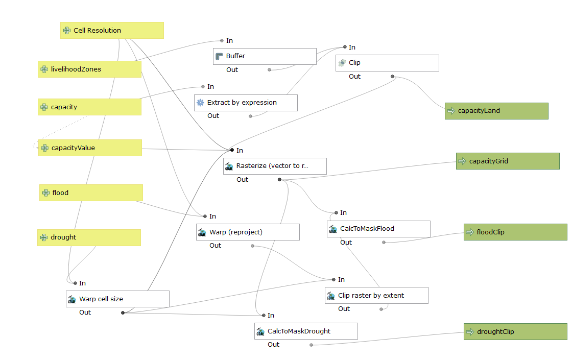
To reproduce the vulnerability assessment, I used a model developed in QGIS that relied upon GRASS processing capabilities. My professor Joseph Holler of Middlebury College largely developed the model. My task was to examine the model in order to understand each of the steps and the parameters set for them, and to be able to manipulate the four outputs in order to create the final vulnerability assessment map. Additionally, I added an input to allow users of the model to set the cell resolution size of the four outputs. The image of the model is provided below and you can download the model here.
Adaptive Capacity
In order to access the DHS data, my professor Joseph Holler applied for special permission from USAID to use the data for a classroom teaching exercise. However, he had to agree to legal conditions, one of which was that only he would actually see the data in its raw form. As such, I never saw the DHS data. Though, I was able to see the metadata and the full list of information categories collected by DHS. With this, I attempted to determine which categories from the DHS were the categories used by Malcomb et al.. Once the category ID columns were determined, the entirety of my class brainstormed to develop the SQL script necessary to take the DHS data, not seen by us, and apply the same weighting used by Malcomb et al.. Our professor then applied our SQL script to perform the analysis with the data and sent the adaptive capacity output for us to use as a main input in the QGIS model. You can download the SQL file here that we collaboratively worked on as a class.
Through this process, we realized that some DHS categories did not consist of a gradient of quantitative values which a quintile breakdown can be applied onto. Some categories were binary results, such as owning a cell phone or if the household was rural or urban. Malcomb et al. did not state in the paper which values on the scale of 1-5 they applied onto these binary survey questions. The different way this data could have been classified is important as it does affect how much weight the answers have in the final adaptive capacity score. For example, choosing to weight these binary responses with the extremes of 1 and 5 will maximize the difference in effect that the two different answers will have on the total adaptive capacity. This may not be a fair outcome, as it assumes the same level of difference as the 1 and 5 rankings of the gradient categories. In other words, owning a cell phone, which would be a rank of 5, would be valued as just as important in household resilience as being a household with the top tier number of livestock. When we ranked these categories as a class, some students applied the 1 and 5 ranking onto the some of the binary categories while others applied a 3 and 4 ranking.
Livelihood Sensitivity
Despite the best efforts of our professor, this data simply could not be located. This is highly questionable and by definition ensures that the methodology of Malcomb et al. is not completely reproducible. As this component consisted of 20% of the authors’ final vulnerability assessment, our best attempts to reproduce will only be able to account for 80% of the variables considered. The shapefiles for livelihood zones are easy to download from FewsNET, however the attribute table is completely empty. My professor brought it to my attention that the values used by Malcomb et al. in association with the livelihood zones are likely not held by FewsNET, but MVAC, for which there is no internet site or online database. However, as you can see in the model, the geographic extent of the empty shapefile of livelihood zones was used as the base layer to define the extents of all output layers.
Physical Exposure
Whereas the adaptive capacity data required preparation prior the QGIS model, the drought and flood risk layers of the physical exposure component of the vulnerability assessment required work after the completion of the model. I downloaded the global flood and drought risk assessment files from the Global Risk Data Platform of UNEP to use as two of my model inputs. At the completion of the model, the drought and flood outputs still needed to be converted into the quintile value format. For droughts, I ran the layer into a r.quantile tool to create a matrix which breaks down the range of drought risk values into 5 quantiles. Then, I used the r.recode tool to transform the layer into quantile form, using the matrix developed from r.quantile as the parameters. As for the flood risk layer, the range of values present was 0 to 4, so I simply used raster calculated and added a value of 1.
After the completion of the model and the transformation of the two physical layers into the 1 to 5 index scale, I calculated the layers together to mimic the percentages of Malcomb et al.’s weighted assessment.
Results
A completed vulnerability map of Malcomb et al. can be found on their published paper.
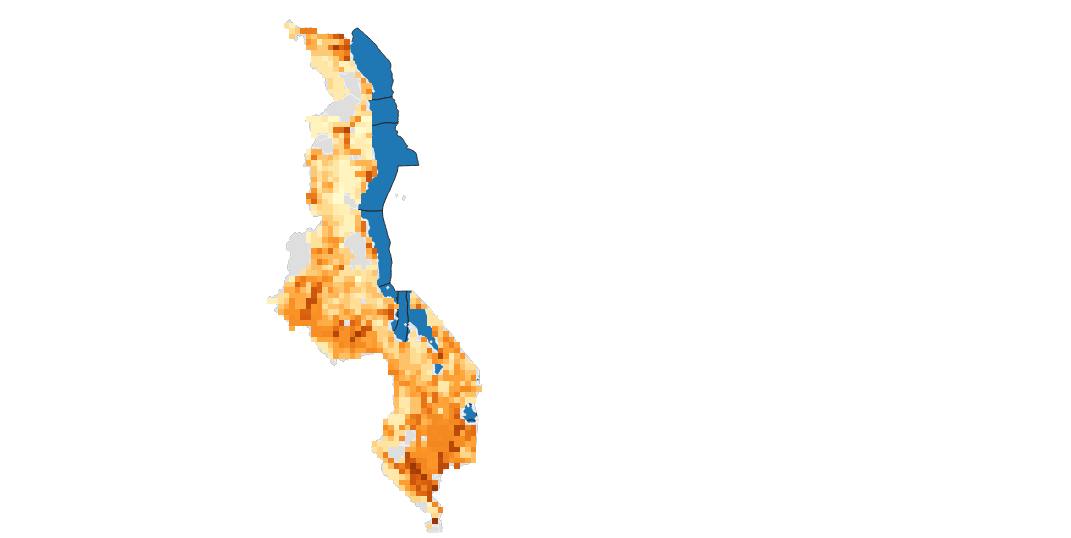 Above is the map I produced with my attempts to reproduce the methodology previously outlined. A high vulnerability is represented with the darker shades of orange, whereas low vulnerability is represented with the light shades. Blue locations are major bodies of water. Locations shaded gray do not contain data - either due to data gaps or because they are national parks and do not contain settlements.
Overall, a comparison between the two maps demonstrates that they each follow similar overall data trends. In each map, there is a large area of high vulnerability in the southern extreme of the country and near the capital of Lilongwe as well as an extended area of low vulnerability in the center of the country. However, there are a few locations where my reproduced map is distinctly different from the original research map. Notably, my map has pockets of high vulnerability in the north of country whereas Malcomb et al. has these locations marked as low vulnerability. Further, the areas of high vulnerability around Lilongwe are much more extended in my analysis. The peninsula which juts into Lake Malawi has a lower vulnerability score in my map. It cannot be determined which factors influenced these differences the most - the inability to access the livelihood zone data which accounted for 20% of Malcomb et al.’s analysis, the subjective decisions required to formulate the DHS information into standardized indices, or a different location within the methodology. Despite my best attempt to follow the methodology of Malcomb et al., it is clear that it is not detailed well enough to allow it to be fully reproduced. An additional critique of Malcomb et al. is that the presence of uncertainty is not mentioned anywhere in the paper. Undoubtedly, uncertainty exists, especially as a large portion of vulnerability assessments involve subjective choices as observations of the real world are transformed into standardized indices (Hinkel, 2011). An honest report of areas of uncertainty in the methodology and final output would assist decision makers, which Malcomb et al. directly appeals to, in their ability to interpret and act upon the data.
Sources Cited
Hinkel, J. (2011). “Indicators of vulnerability and adaptive capacity”: Towards a clarification of the science-policy interface. Global Environmental Change, 21, 198-208. doi:10.1016/j.gloenvcha.2010.08.002.
Malcomb, D. W., Weaver, E. A., & Krakowka, A. R. (2014). Vulnerability modeling for sub-Saharan Africa: An operationalized approach in Malawi. Applied Geography, 48, 17–30. https://doi.org/10.1016/j.apgeog.2014.01.004
Return to QGIS and PostGIS Index Page.
Return to Main Index Page.