Twitter Activity during Hurricane Dorian
Which created more Twitter activity during the storm: The hurricane or Sharpiegate?
Return to QGIS and PostGIS Index Page.
Return to Main Index Page.
Introduction
Hurricane Dorian was an intense Category 5 hurricane that caused significant damage and loss of life throughout much of its course. When the storm directly hit the Bahamas, its winds were so strong that the storm became tied for the highest recorded hurricane winds in the Atlantic Ocean to ever make landfall. After the grave destruction the storm caused on the Bahamian Abaco Islands, Dorian slowly weakened though remained a powerful hurricane as it closely followed the US coast northward. As a result of the storm’s extreme destruction in the Bahamas and how closely it hugged the entirety of the US east coast, this storm generated a significant amount of attention, particularly along the east coast locations predicted to be nearest to the storm. However, the media attention for this storm was even greater than that generated from the physical risks of Dorian because of the controversy that surrounded Sharpiegate, which you can read about on this Wikipedia page.
The scope of this lab is to determine how much of an effect Sharpiegate had on the Twitter activity related to Hurricane Dorian. Specifically, I will examine if the most significant pockets of storm tweets corresponded with the accepted storm prediction or if the storm clusters followed the storm prediction of Sharpiegate. Essentially, this lab will examine which scenario had a greater effect on the spatial distribution of storm tweets: the real storm prediction or an exuberantly defended and well circulated mistake. Through this, the lab addresses the concept of whether reality or gossip more strongly effects people’s actions. My ability to pursue this geographic question is representative of a new age of spatial data that is generated en masse by individual users and not by authoritative geographic bodies as was the accepted norm in previous decades. As Elwood et al. (2011, p.585) outlines, this new and massive source of volunteered geographic information “could serve as a potential data source to address questions across geography.” This lab is an example of research which simply was not possible before volunteered geographic information.
Data Sources
The data for this lab was collected in rStudio through a Twitter API. Professor Joseph Holler of Middlebury College searched for storm data on September 11, 2019 and searched for the baseline data on November 19, 2019. Only tweets which contained the words ‘dorian’, ‘hurricane’, or ‘sharpiegate’ were collected as storm data. There were no lexicon parameters for the baseline data. For each set of data, tweets within one week prior to the search date were considered and the geographic range was set as 1,000 miles around the coordinates of 32, -78. For each set, 200,000 tweets that match these parameters were mined. If you want to perform analyses with the data I used, here are the excel files of the status ids of storm tweets and baseline tweets.
In rStudio, I defined the geographic boundaries of each tweet and developed two graphics related to a lexicon content analysis of the tweets. I also used a Census API to pull a map of the United States with all counties filled with population data. I then connected directly to my Postgres database from rStudio and transferred the storm tweet data, baseline tweet data, and populated county data to my database. I conducted a series of SQL steps with my database using the QGIS interphase. Upon the completion of my analysis, I used GeoDa to develop four maps using Getis-Ord G* spatial statistics.
Analysis Overview
The main steps in this lab included twitter content analysis in rStudio, SQL analysis in PostGIS to calculate frequency of storm of tweets by county population and the rate of storm tweets normalized by baseline data, and the conversion of this spatial data into maps using GeoDa.
rStudio Steps
I first determined the geographic extent of tweets by converting the attached GPS coordinates into a latitude-longitude format for the storm and baseline datasets. I only selected tweets with a GPS bounding box specific to either a city, neighborhood, or precise location. I then converted these bounding boxes into a centroid point which became the point of my latitude-longitude conversion.
With a specific geographic point attached to each tweet, I then began to analyze the content of the tweets for both storm and baseline datasets. I had a series of preliminary steps to identify words, count words, remove defined stop words, and identify words which appear at least 15 times together as word pairs. This then enabled me to perform the final steps of displaying the frequency of the 15 most used unique terms in a bar graphic and the development of a network association graphic to display which words most commonly are used with each other in tweets.
Aside from the analysis of tweet information, I pulled population data from the Census API and mapped it with the GGPlot library in rStudio.
PostGIS SQL Steps
After pulling from rStudio, I had three datasets in my PostGIS database: populated counties; storm tweets; baseline tweets. I first added a geometry column to each of my three dataset tables with the desired projection. Since most of the twitter activity data was in the eastern half of the country, I chose to exclude western states from my counties layer.
Since every county in the counties layer had a unique geoid, I intersected all of the tweets with the counties and added the tweets’ respective geoid on the attribute tables of the two tweet dataset tables. For both the storm and baseline tweets, I then dissolved the tweets by county geoid and summed the count of tweets per county. I included a map in the annotated SQL workflow to show the output of this step for the storm tweets. I then added a column for the storm tweets and baseline tweets in the counties layer and filled it with the summed count of tweets for each county, which I also included a map of in the SQL workflow. In preparation for the next steps, all counties without storm or baseline tweets had a value of 0 in these columns as a null value could not be calculated in the following equations.
At this point, all of the data I need is within the counties layer. I then added a new column to calculate the frequency of tweets normalized by population for the storm tweet data. I used the following equation to calculate this: ((# of tweets/ county population) * 10000). I added an additional column to calculate the normalized difference between storm data and the baseline. For this, I used the following equation: (count of storm tweets - count of baseline tweets)/((count of storm tweets + count of baseline tweets)* 1.0) where storms tweets + baseline tweets > 0.
GeoDa Spatial Statistics Steps
In these steps, I used the tools of the program to calculate the Getis-Ord G* spatial statistic of the storm tweet frequency normalized by county population and of the normalized difference between storm tweets and baseline tweets. This produced two of the same-styled maps for each calculation. One map is a hot-cold map with some counties shaded red, some blue, and others left neutral. The second map is the display of these counties shaded in the hot-cold map, but with shadings of green to demonstrate statistical significance. Further explanation of how to interpret these maps is explained in the results section.
Annotated SQL Workflow in PostGIS
With Maps of Selected Steps
Developed by Ian8VT

SELECT addgeometrycolumn('public', 'dorian', 'geom', 102004,
'POINT', 2);
UPDATE dorian
SET geom = st_transform(st_setsrid(st_makepoint(lng,lat),4326),102004);
SELECT addgeometrycolumn('public', 'november', 'geom', 102004,
'POINT', 2);
UPDATE november
SET geom = st_transform(st_setsrid(st_makepoint(lng,lat),4326),102004);
/*adds point geometry to each table */

UPDATE "novemberCounties"
SET geometry = st_transform(geometry,102004)

DELETE FROM "novemberCounties"
WHERE statefp NOT IN ('54', '51', '50', '47', '45', '44', '42', '39', '37',
'36', '34', '33', '29', '28', '25', '24', '23', '22', '21', '18', '17',
'13', '12', '11', '10', '09', '05', '01');

ALTER TABLE dorian ADD COLUMN geoid varchar(5);
ALTER TABLE november ADD COLUMN geoid varchar(5);

UPDATE dorian
SET geoid = "novemberCounties".geoid
FROM "novemberCounties"
WHERE st_intersects("novemberCounties".geometry, dorian.geom)
/*applying geoid of each county onto the tweets present in that county*/

UPDATE november
SET geoid = "novemberCounties".geoid
FROM "novemberCounties"
WHERE st_intersects("novemberCounties".geometry, november.geom)

ALTER TABLE dorian ADD COLUMN count INTEGER;
UPDATE dorian SET count = 1;
CREATE TABLE doriantweets AS
SELECT a.statefp, a.countyfp, a.pop, a.geometry, b.status_id, b.count, b.geoid, b.geom
FROM "novemberCounties" AS a left join dorian as b
ON a.geoid = b.geoid;
/*created table of tweets and only of those that overlay with the previously selected county geoids. a count column is added to sum tweets per county in next step*/

CREATE TABLE doriantweets_counties AS
SELECT  geoid, st_union(geom), sum(count)
FROM doriantweets
GROUP BY geoid
/* dissolves all tweet points within same county geoid as a single geometry*/
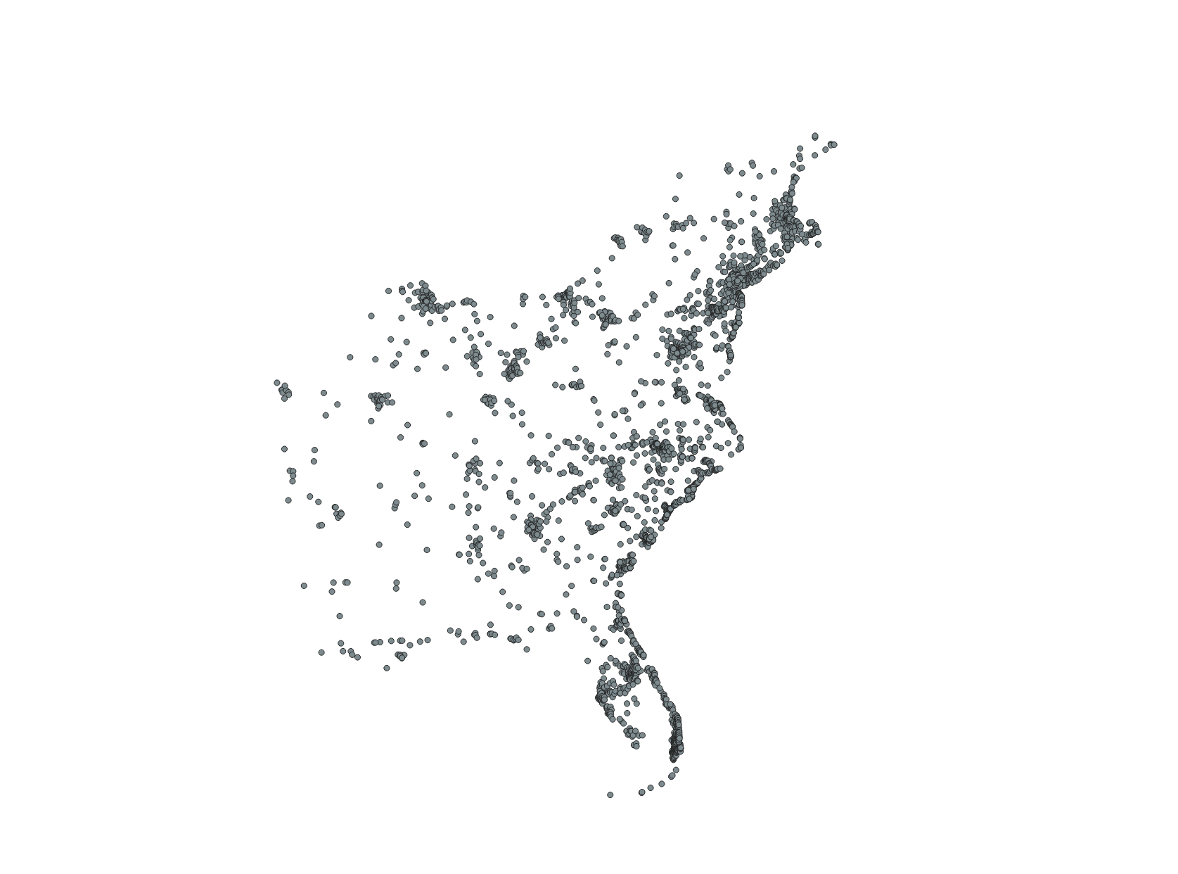
This is the map of the doriantweets_counties table created in the previous step. All points that are within the same county are a single multipoint geometry with a single summed count of how many tweets occurred within that county. Once the equivalent of this output is created for the baseline tweets, these values can easily be transferred into the counties layer since this point data contains the geoid of the county it overlays.
:: ERROR, not the desired results. Realized the from map was not the proper location to compile total tweet database
::ALTER TABLE doriantweets ADD COLUMN tweets INTEGER;
::UPDATE doriantweets SET tweets = doriantweets_counties.sum
::FROM doriantweets_counties
::WHERE doriantweets.geoid = doriantweets_counties.geoid
::/* map of counties with sum tweets of each county present in attribute table. for some reason there are multiple identical counties in the attribute table */


ALTER TABLE "novemberCounties" ADD COLUMN tweets INTEGER;
UPDATE "novemberCounties" SET tweets = doriantweets_counties.sum
FROM doriantweets_counties
WHERE doriantweets_counties.geoid = "novemberCounties".geoid
/* map of counties with sum tweet data. each county is correctly represented without the error from the previous sql attempt */

CREATE TABLE counties AS
SELECT statefp, countyfp, geoid, geometry, pop, tweets as tweets_dorian
FROM "novemberCounties"
/* consolidating data table*/

ALTER TABLE november ADD COLUMN tweet INTEGER;
UPDATE november SET tweet = 1;
CREATE TABLE november_tweets AS
SELECT geoid, st_union(geom), sum(tweet) as tweets
FROM november
GROUP BY geoid;
ALTER TABLE counties ADD COLUMN tweets_november INTEGER;
UPDATE counties SET tweets_november = 0;
UPDATE counties SET tweets_november = november_tweets.tweets
FROM november_tweets
WHERE counties.geoid = november_tweets.geoid
/* all the steps to sum the total november tweets for each county. performed it in a more condensed manner after learning the process with the dorian tweets above. now total dorian and november tweets are their own column within the same county table*/
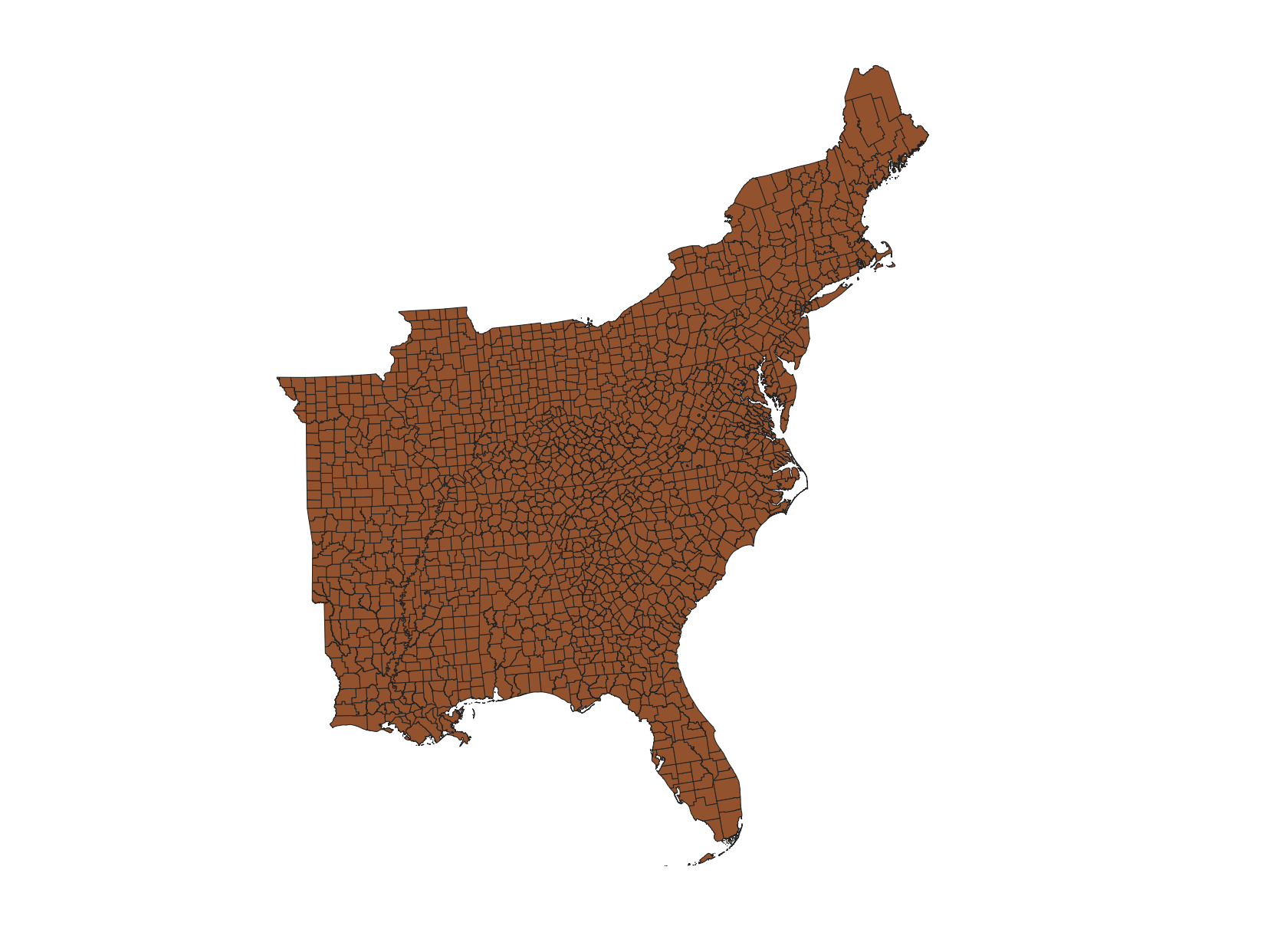
As you can see, this map only visually displays the counties. Yet, within the attribute table, all of the summed counts of storm tweets and baseline tweets are attached to each county in this map. In the next steps, the outputs of the calculation will also be attached in the table with its respective county.
UPDATE counties SET tweets_dorian = 0;
UPDATE counties SET tweets_dorian = doriantweets_counties.sum
FROM doriantweets_counties
WHERE doriantweets_counties.geoid = counties.geoid
/* fixing dorian tweets column so the null values appear as 0 */

ALTER TABLE counties ADD COLUMN tweets_dorian_per10k REAL;
UPDATE counties SET tweets_dorian_per10k = ((tweets_dorian/pop)*10000)
/* normalizing storm tweet data by a population of 10000*/

ALTER TABLE counties ADD COLUMN ndti REAL;
UPDATE counties SET ndti = (tweets_dorian-tweets_november)/((tweets_dorian+tweets_november)*1.0)
WHERE tweets_dorian+tweets_november>0;
UPDATE counties SET ndti = 0
WHERE ndti is null
/*normalizing the difference between storms about the storm and the basline twitter activity for the month of november. positive value means occurence of storm tweets greater than the tweet baseline, negative value means storm tweets lower than baseline*/
Click here to download the SQL file.
Results
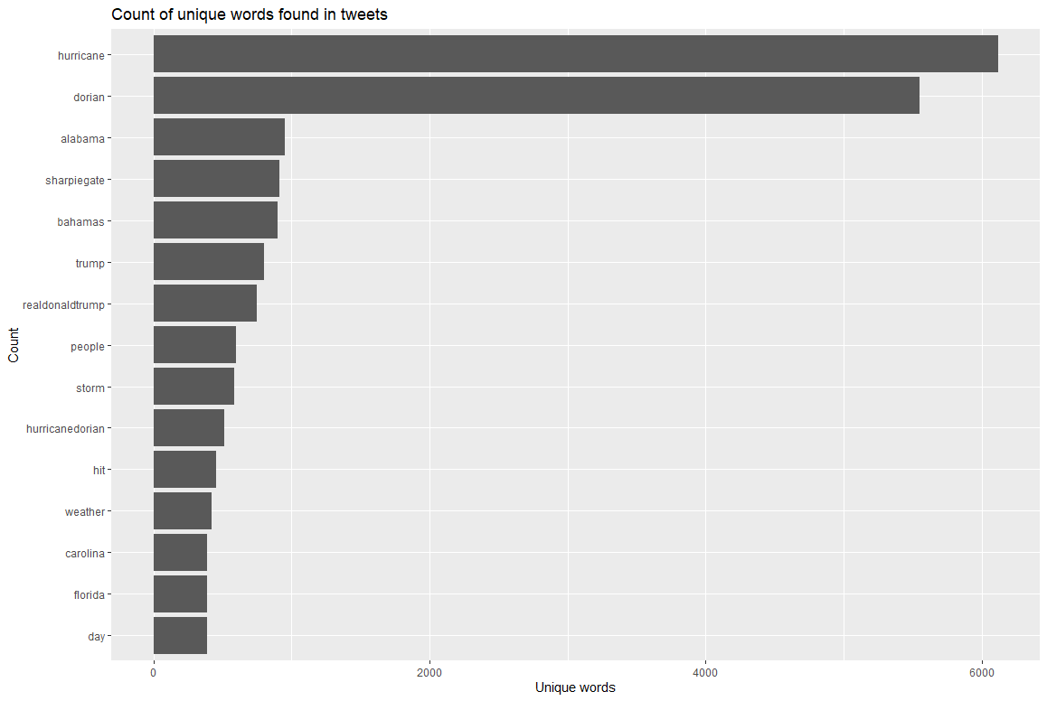
This graph, developed in rStudio, displays the frequency of the 15 most commons words in tweets related to the storm. The two most frequently used unique terms are ‘hurricane’ and ‘dorian’, which does not come as a surprise since nearly all tweets which discuss the storm must use these two general terms. Noticeably, the controversy-related terms of ‘alabama’ and ‘sharpiegate’ are the next two most commonly used unique terms in tweets about the storm. Further, the unique terms of ‘donald’ and ‘realdonalddrumpf’, in reference to the President and his twitter account, are also frequently used and are likely in association with discussion about the Sharpiegate controversy.
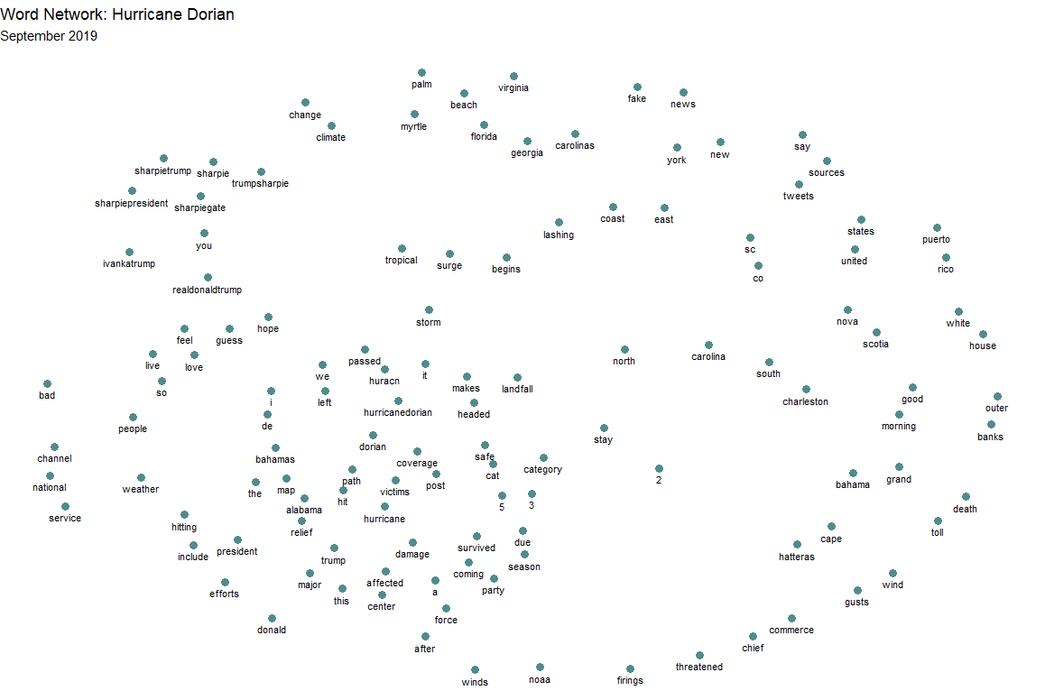
This graphic which looks remotely similar to a hurricane was developed in rStudio and displays how words are clustered together in conversation. The closer the proximity of words are within this graphic, the more frequently they were used within the same tweet. Only words that occur at least 30 times are included within this graphic. Note the cluster in the top left, which demonstrates that various terms related to Sharpiegate commonly occur alongisde ‘realdonalddrumpf’, the Twitter account for the President. In the top central, it is clear that a number of geographic place names such as ‘carolinas’, ‘virginia’, ‘myrtle’ and others frequently occur together in tweets. It is also seen that the terms ‘fake’ and ‘news’ frequently occur together in tweets. In the center, it is noticeable that the term ‘hurricane’ is frequently paired with other storm-related terms such as ‘damage’, ‘victims’, ‘path’, and ‘hit’. Interestingly, ‘alabama’ is also in the same conversational cluster and has close proximity to the terms of ‘relief’, ‘map’, and ‘trump’.
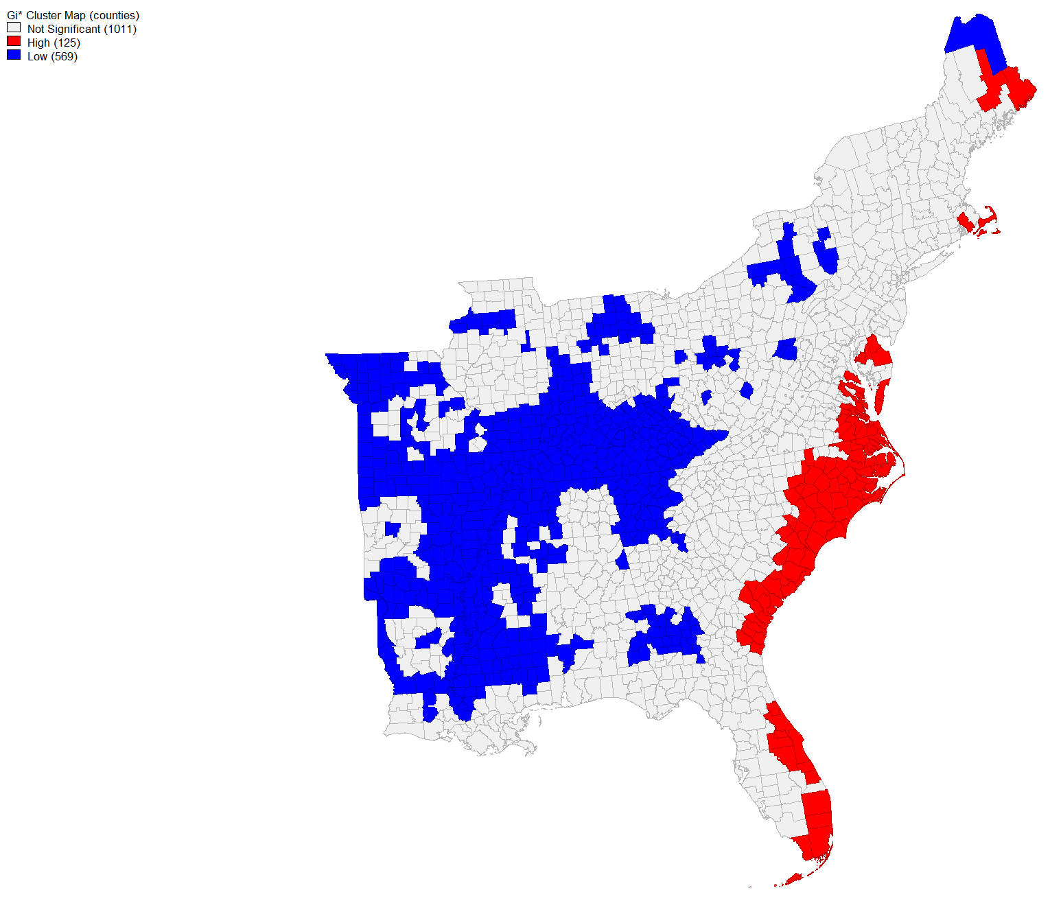
This map, developed in GeoDa, is of the hot spots and cold spots of twitter activity related to the storm. This graphic is a result of normalizing the count of storm tweet activity for each county by population and then performing a Getis-Ord G* statistical analysis on the normalized rate. Counties shaded red contain a rate of twitter activity about the storm which is high for its population. Conversely, the frequency of storm tweets in blue counties is low for its populations. This means that the rate of storm tweets was high for many of the counties along the coast and nearest to the storm’s predictions and occurrence. Interestingly, the counties of Georgia and Alabama which were referenced in the Sharpiegate controversy have a tweet rate about the storm that is low for their population.
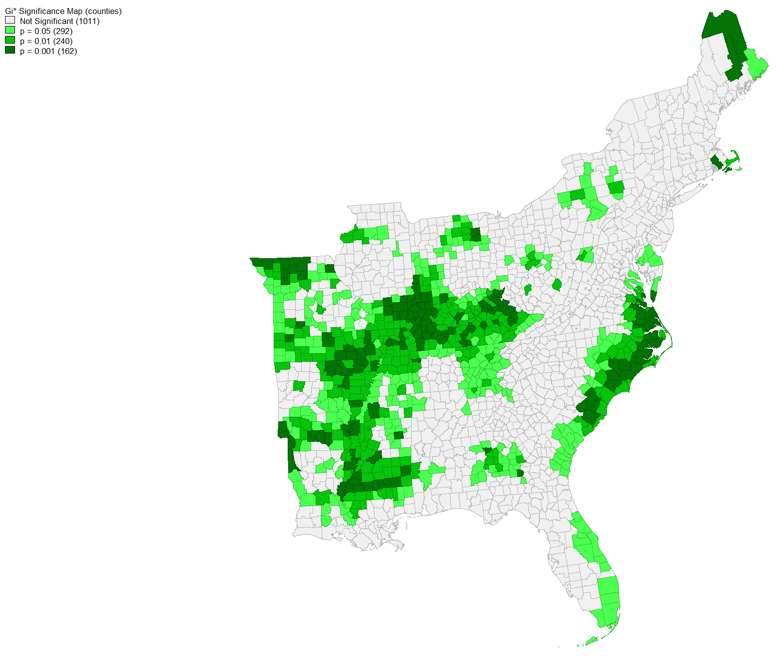
This map, developed in GeoDa, contains the same data from the previous hot-cold map on the frequency of tweets related to the storm normalized by population. However, this map displays how significantly high or low the frequency of storm tweets were for the population of counties. Using the hot-cold map as your filter, you can see how significantly high or low the frequency of storm tweets were for counties. The darker the shade of green, the more statistically significant those counties’ storm tweets were for its population.
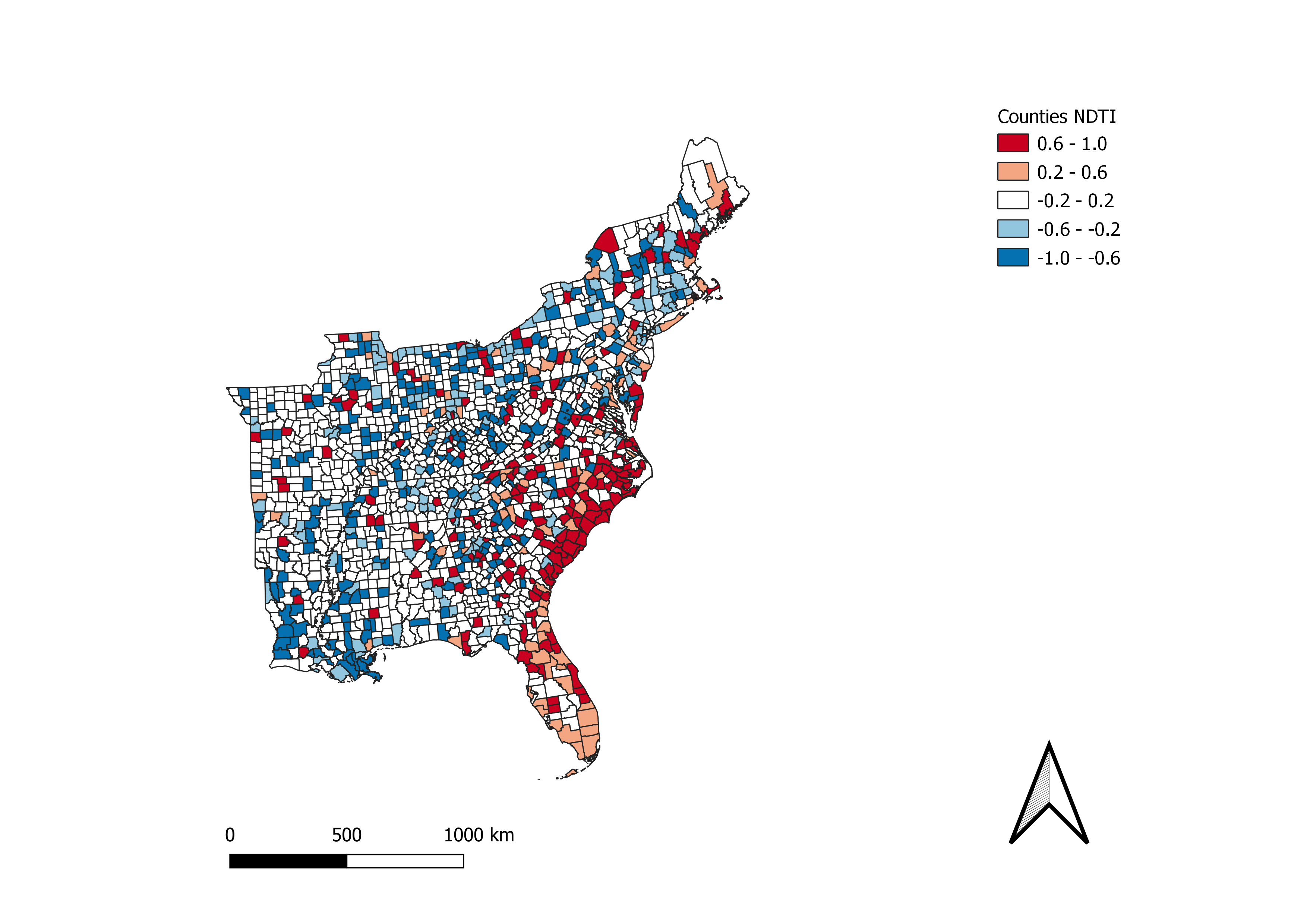
This map, developed in QGIS, is a choropleth map of the normalized difference of Twitter activity between storm tweets and the baseline. Red shaded areas are counties in which the frequency of storm tweets was greater than baseline. Blue shaded areas are counties in which the frequency of baseline tweets was greater than tweets related to Hurricane Dorian. The darker the shade, the greater the difference.
Conclusion
It is evident from the context analyses of tweets that the Sharpiegate controversy made an impact in social media. This was an event that people talked and tweeted about, to such an extent that two of the directly related terms were the 3rd and 4th most tweeted unique words among all tweets about Hurricane Dorian. Further, the network analysis of twitter content demonstrates that terms related to this controversy were associated with terms that relate directly to the storm. However, the spatial statistical analyses and their related maps demonstrates that the spatial frequency of who talked about the storm reflected the real and actual path of the hurricane. The normalized difference map demonstrates that the counties along the coast had an increased frequency of tweets relating to the storm. Compared with the Sharpiegate path of the storm, the hot-cold map of normalized population shows that the counties of this area were cold spots of Hurricane Dorian Twitter activity. As such, although the Sharpiegate controversy made significant ripples in Twitter activity, it did not result in a shift in the spatial distribution of tweets away from the actual storm path. Despite the vast potential for volunteered geographic information to expand the research potential of geographic analyses, it must be acknowledged that geocoded Twitter activity only accounts for 1% of all tweets. Who tweets and who willingly attaches geographic information about their tweet locations is not a qualitative analyses that I performed in this lab. Crawford and Finn (2014) encourage researches to remain cautious and not overstate the results that are presented from data gathered from social media as it likely does not equitably represent the population of a geographic area. Additionally, Crawford and Finn (2014) demonstrate that social media activity typically spikes around a disaster, then quiets down even while many individuals who were the most affected by the disaster will continue to remain effected longterm. For this lab, my temporal extent of data that I considered was one week and does not consider the long term. As such, it must be reiterated that my results is an analysis of how 1% of Tweets about the storm were spatially concentrated in comparison to the storm’s predicted path in comparison to the false predicted path of Sharpiegate. The result is not a map of which regions were most effected by the storm.
Cited Literature
Crawford, K., Finn M. (2015). The limits of crisis data: Analytical and ethical challenges of using social and mobile data to understand disasters. GeoJournal, 80, 491-502. doi:10.1007/s10708-014-9597-z
Elwood, S., Goodchild, M. F., & Sui, D. Z. (2011). Researching volunteered geographic information: Spatial data, geographic data, geographic research, and new social practice. Annals of the Association of American Geographers, 102, 571-590. doi:10.1080/00045608.2011.595657
Return to QGIS and PostGIS Index Page.
Return to Main Index Page.